Table of Contents
Duration: 1.5 years
Role:
Graphic Designer/Art Director
Tools:
Adobe Creative Suite, Microsoft Office, Figma, Canva
Overview
Tru Universe is a Canadian payment solution provider with over 30 years of industry experience, delivering integrated solutions for their forward-thinking clients to reward and incentivize customers, employees, and partners. Tru needed a refreshed brand identity that aligned with their evolving market and client expectations. This project focused on reflecting the company’s commitment to flexibility, technological innovation, and strategic empowerment through a comprehensive rebrand.
Challenge and Role
Our team helped transform their image from a traditional payment provider into an innovative leader at the intersection of marketing and fintech. The challenge was not only to modernize the decades-old branding, but to reflect and refresh their core values and offering.
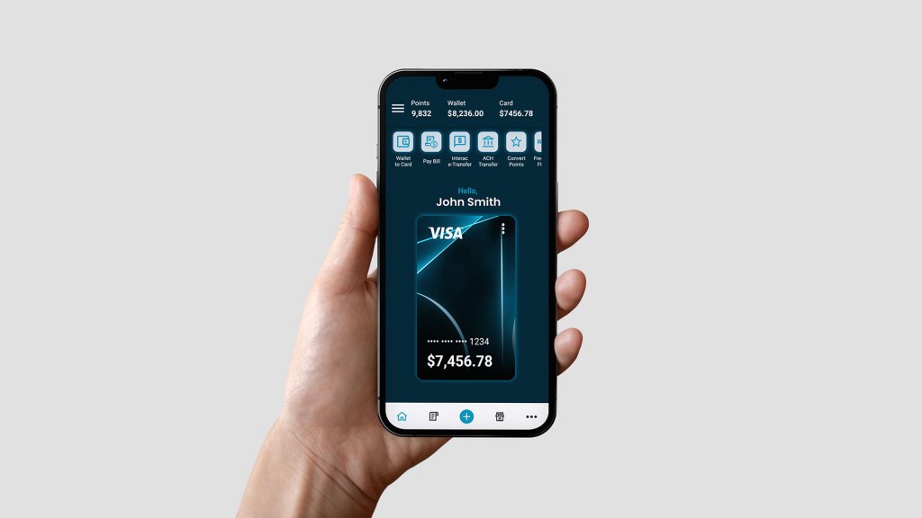
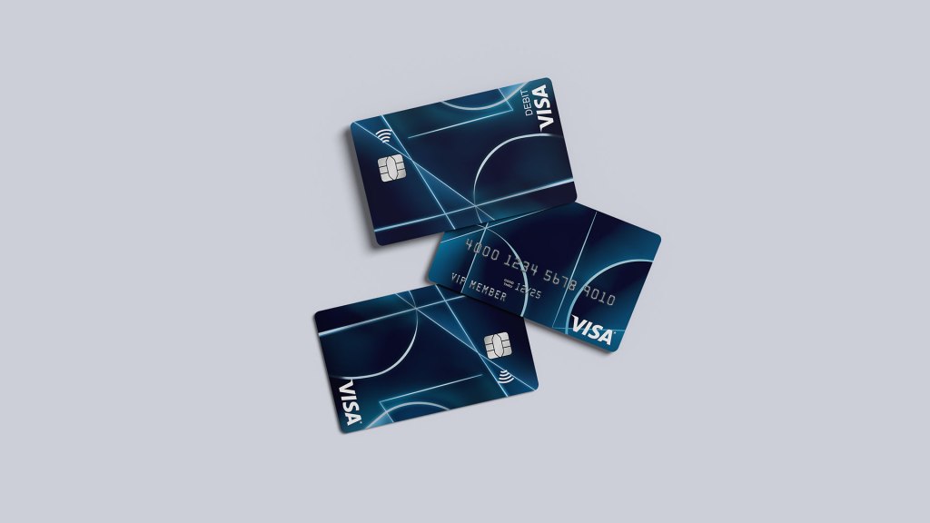
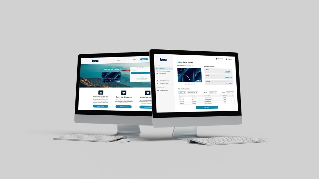
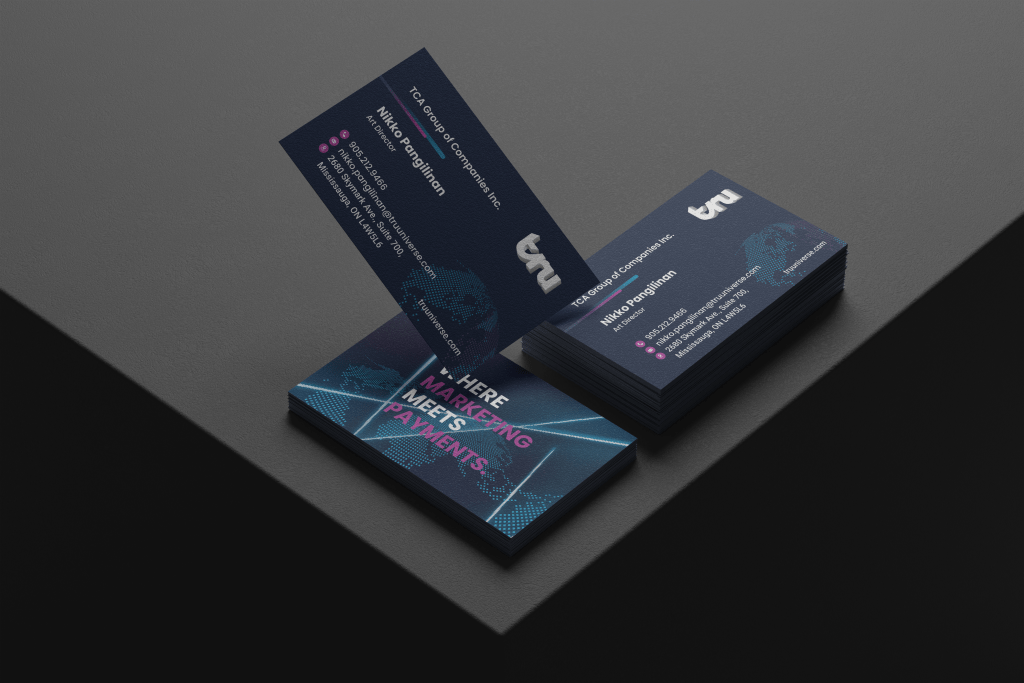
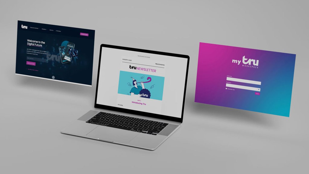
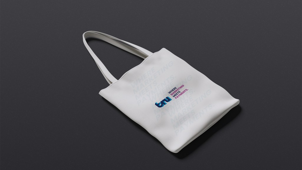
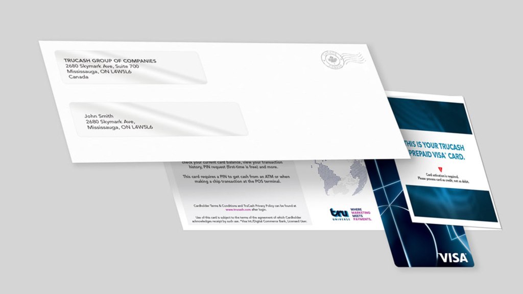
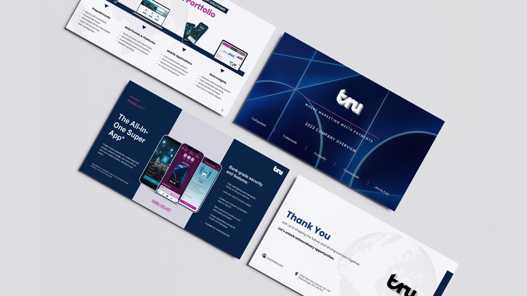
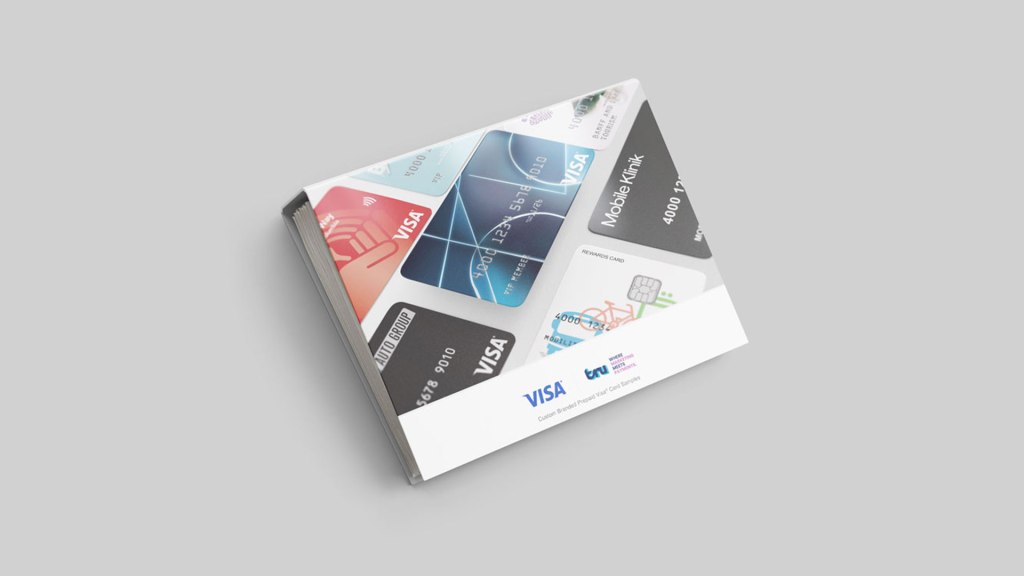
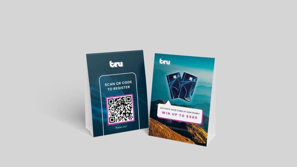
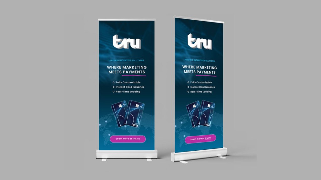
The full rebrand included logo design, colour palette, typography, internal forms, stationery, employee intranet portals, client dashboards, cardholder portal, social media, presentation decks, products and the corporate website. I owned and spearheaded the design of the print collateral, created print templates for the in-house fulfillment department, and collaborated with external vendors on order fulfillment, spatial event booth kits and marketing print materials.
As the Graphic Designer/Art Director, my role was to shape the new visual identity, providing creative direction, mentorship, and ensuring that all assets aligned with the company’s new, forward-thinking vision.
Brand Strategy and Approach
We began by redefining Tru’s brand positioning, shifting the narrative to emphasize flexibility, customization, and client empowerment. We audited the old branding to categorize which items still resonated with clients and the market, removing those that didn’t. The team collaborated to study industry trends and research competitors’ strategies. We used the findings and keywords to create mood boards, which were presented to stakeholders. The updated messaging, “Where Marketing Meets Payments,” served as a rallying call for businesses seeking real-time rewards and advanced digital payment solutions.
Keywords: Cutting-edge, Data-Driven, Fintech, Global, Innovation, Modern, Trust
Google Ads: Employee Incentives, Prepaid Visa® Cards, Virtual Prepaid Visa® Cards
Putting It All Together
A new digital asset management system was created to house the new branding assets, and is easily accessible by employees. New branding documentation was developed as a guideline for the new assets covering the new logo, colour palette, typography, tone of voice, imagery, and more.
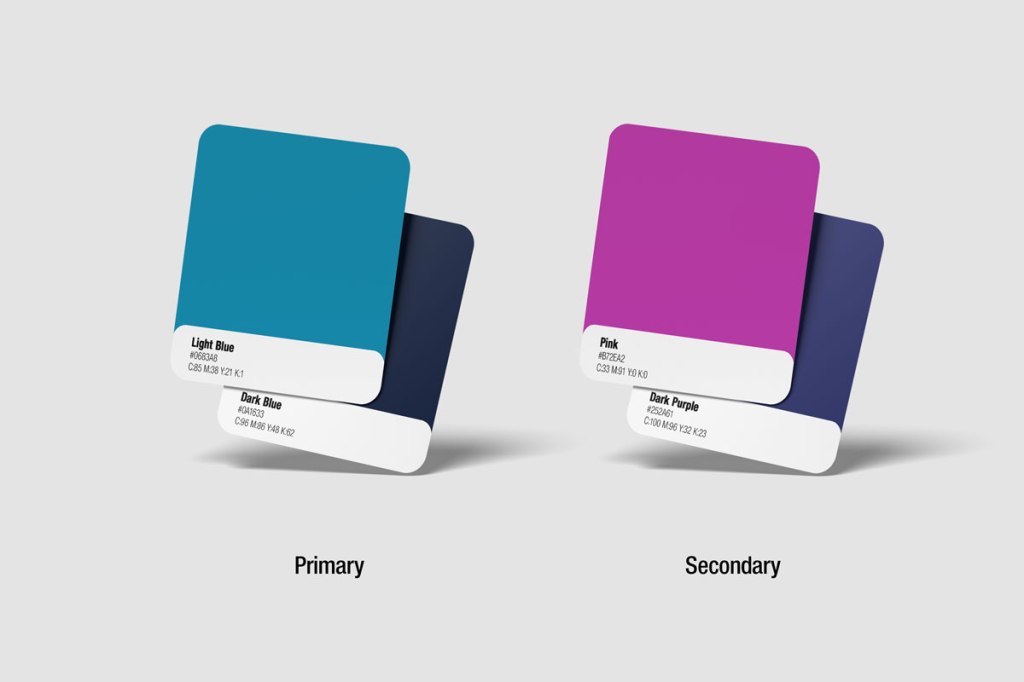
Colour Palette
Transitioning away from the old red and black branding, we developed a colour palette that represents the modern change and visually stand out from the competition.
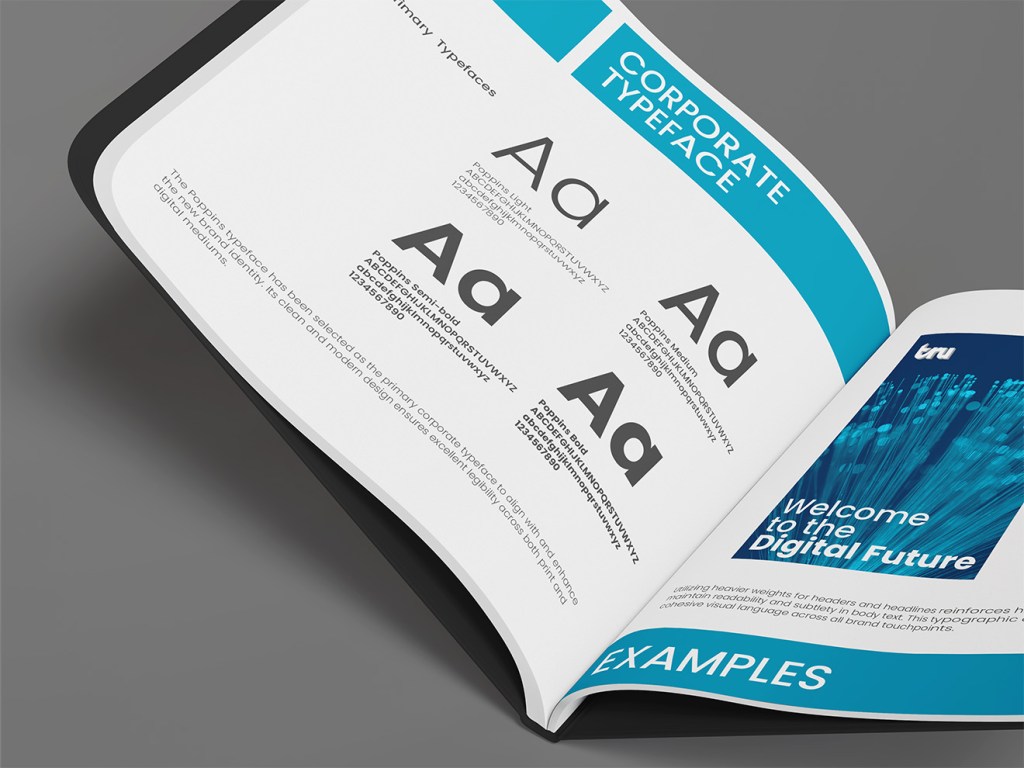
Typography
The Poppins typeface was selected to be the primary corporate typeface to complement the new branding. It offers a clean, modern look and easy legibility across print and digital touchpoints. Heavier weights are used for headers and headlines, while lighter weights are reserved for body copy.
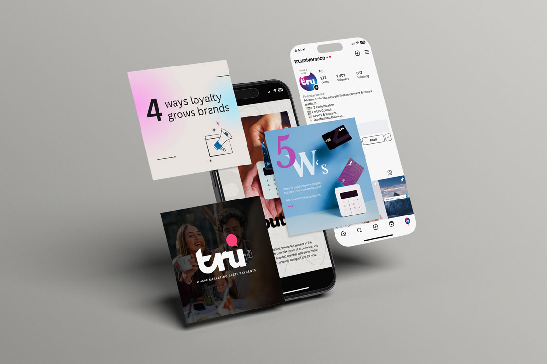
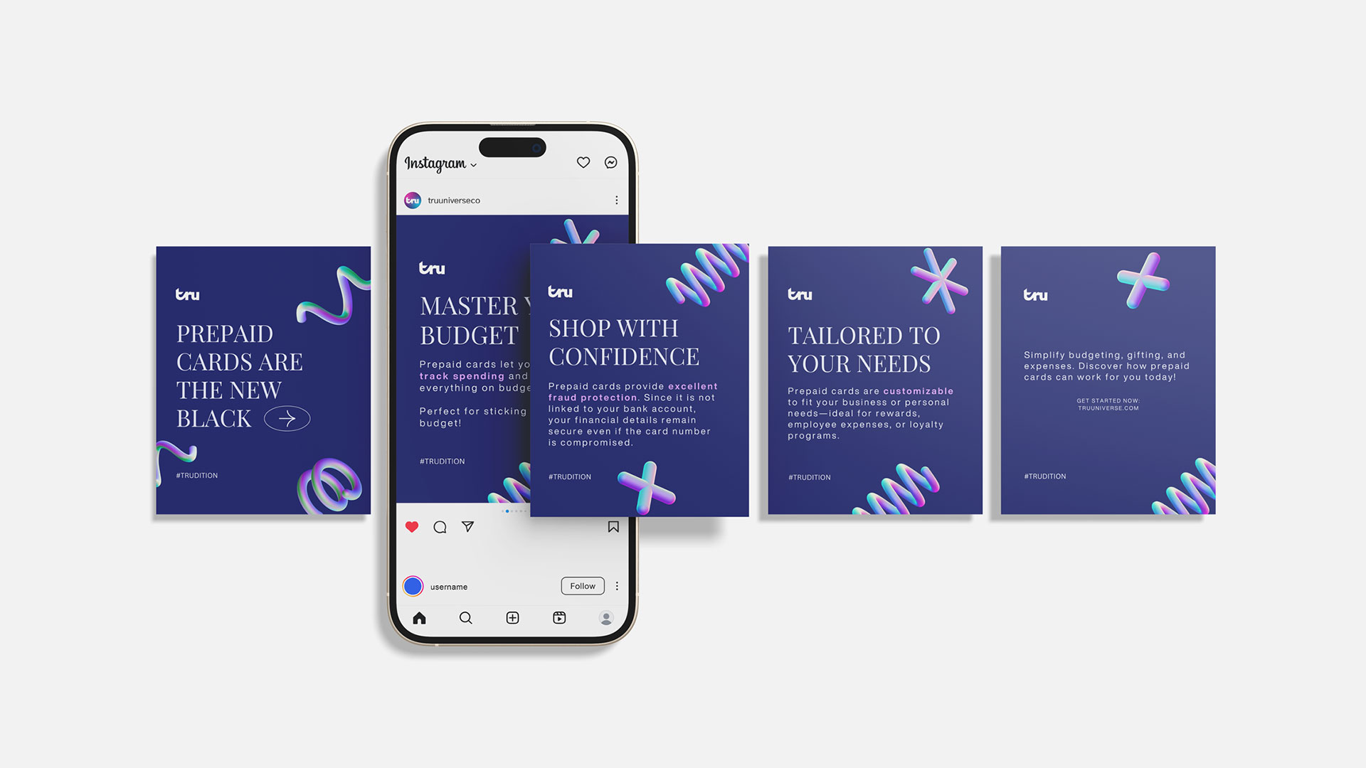
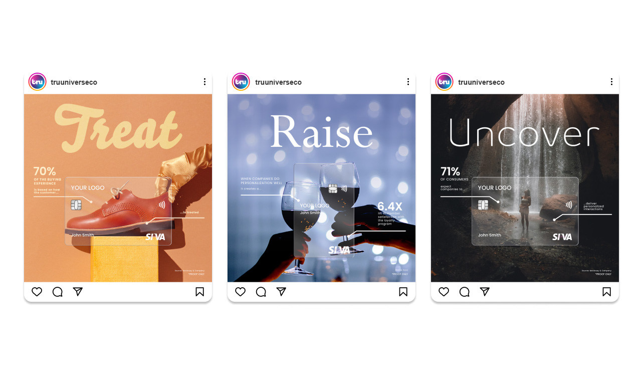
Social Media
LinkedIn content was formal, and informative catered to our B2B target audience (e.g. Executive decision-makers, such as C-suite executives or division/department managers).
Instagram content catered to both executives and cardholders, allowing us to post marketing promotions, company achievements, and informative statistics. Content is flexible and shareable.
Rebrand Statistics
The rebranding resulted in a very positive turnaround across all touchpoints. Several months after its initial implementation, we have seen an increase in traffic from organic search leading to the corporate website. The sales department was able to shorten closing timelines, benefiting from the streamlined information, achieving a closing rate of 48% from warm leads. Social media user engagement increased by 50%, and follower growth increased by 10%.
Final Designs
Office Display

